Anyone who’s ever re-painted a house will tell you, there’s nothing more satisfying than stepping back from your hard work to admire the fruits of your labour when it’s completed. Especially when the house in question happens to be an ancient Ibicenco finca painted a very specific yellow hue in parts, and a signature shade of pink in others. It’s not just our beloved maintenance team who get the satisfaction of seeing a newly refreshed Pikes every season – this year, our creative and marketing teams are revelling in the results of an online makeover that’s been brewing for the last few months.
Today, we lift the proverbial curtain on our website’s latest facelift to reveal a shiny new aesthetic designed to breath fresh life into our online world. It was super important to us that we stay 100% true to the history and heritage of Pikes, while also taking inspiration from our Balearic Island home and adding a sprinkling of rock and roll to our overall look and feel.
First and foremost, you’ll notice a brand-new colour palette across the entire site and our social media channels – and if you sense a feeling of familiarity, that’s just our intention! You see, rather than reach for the good old Pantone swatches (as is usually the case in projects like these), our Head of Design Ian Walsh took a different approach to the design process, checking into the hotel to immerse himself in all the unique and quirky elements that make Pikes tick for inspiration.
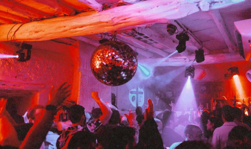
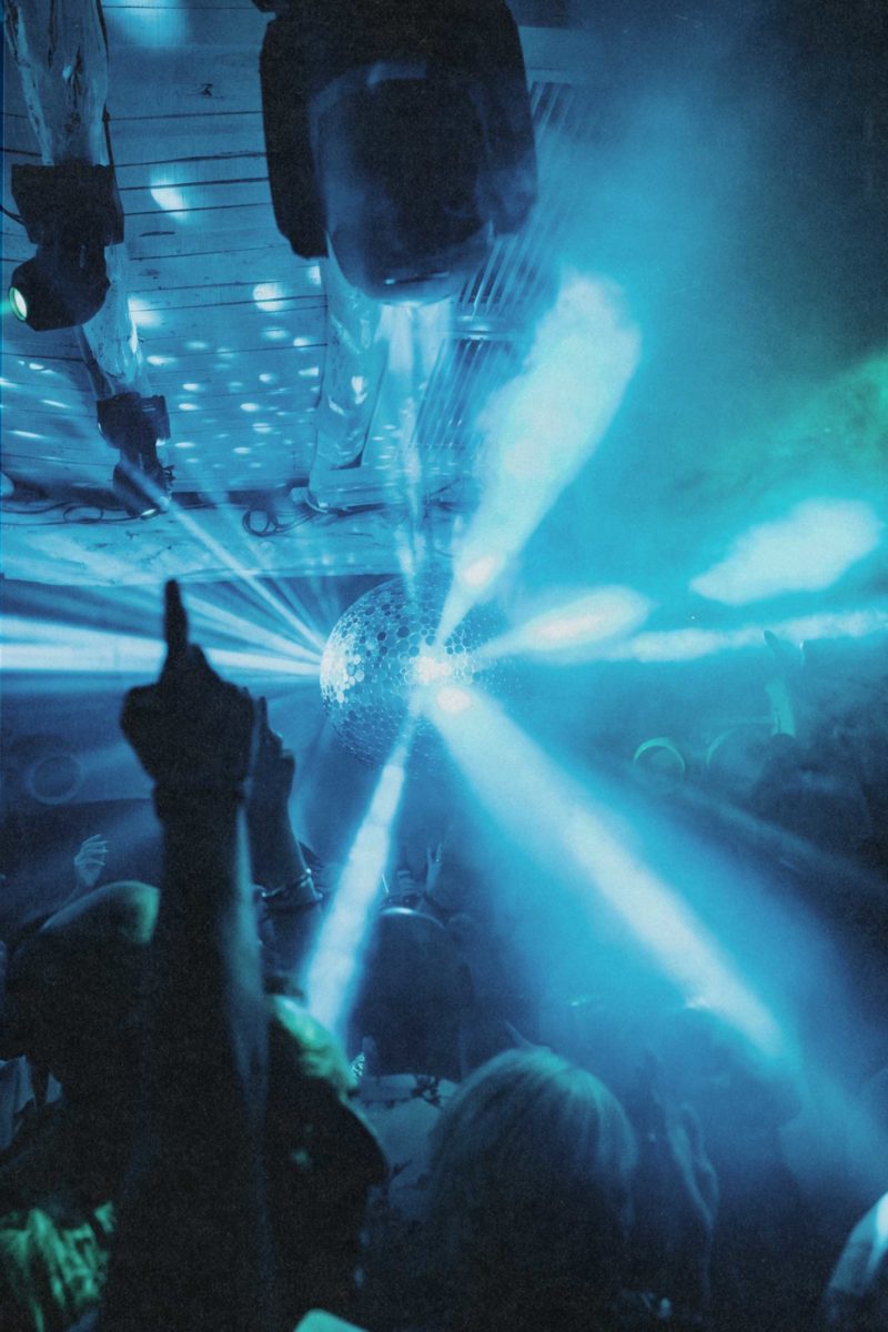
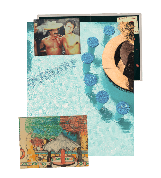
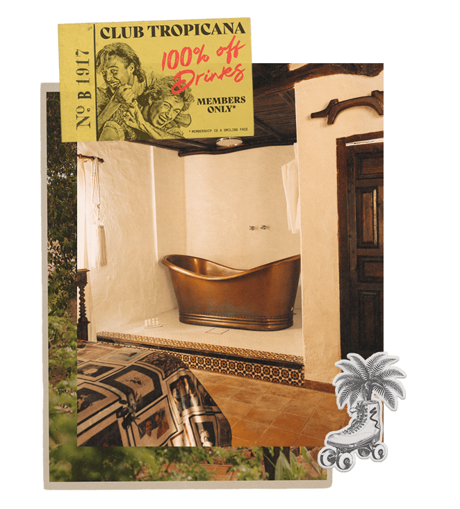
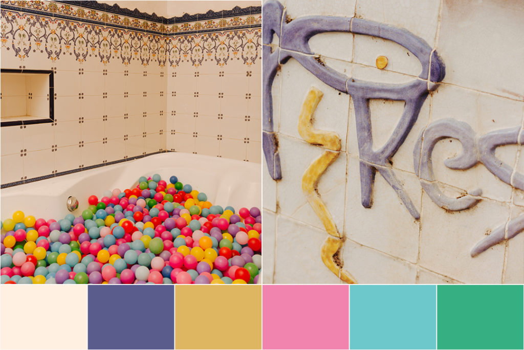
It was once particular evening in Freddies, before the late-night crowds had started filtering in, when Ian found himself staring long and hard at our Bathtub Club. We know our guests love rollicking around in the Jacuzzi-slash-ballpit while a DJ spins the soundtrack in the world’s tiniest club room (and who can blame them?), but when he laid eyes on the ballpit completely devoid of clubbers – the veritable calm before the storm – Ian was mesmerised by the mix of pastel-hued plastic balls juxtaposed against the vintage Spanish tiles that Tony Pike had once laid by hand. A colourful vision revealed itself and from that moment on, the project began to take shape quickly.
Colour-matching the website elements with six shades that are completely unique to Pikes was the next challenge. We got Ian to talk us through his choices:

Balearic Blue – Pikes aficionados will recognise this beautiful shade of azure as the exact same hue that featured in the original Pikes logo (now re-tiled into the stone walls of our car park), and that pops in the patterned tiles around the pool and in some of our original bathrooms – including the Jacuzzi room in Freddies.

Fun & Sunshine – There’s no colour more fitting than yellow for Pikes, and this particular shade takes its cues from two elements of the hotel: the original yellow accent in our logo, and the matte yellow balls in the Bathtub Club.

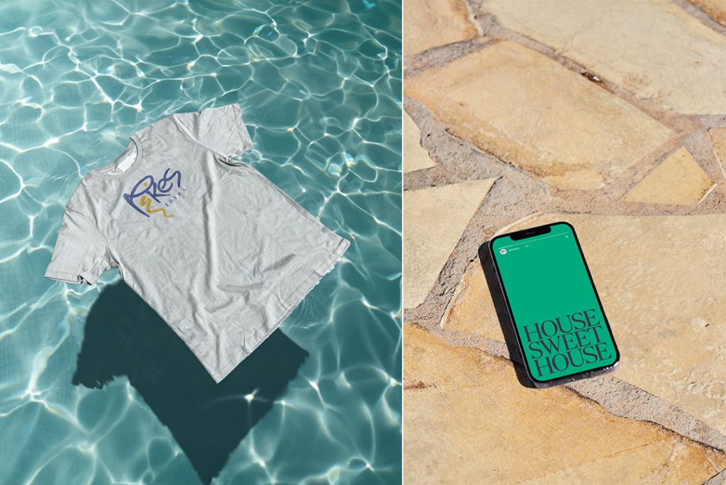
Pamelas Pink – Need we say more? As a matter of fact, it’s not just our candy-coloured restaurant that inspired this bright (but not gaudy) shade of blush, it’s also – you guessed it – the balls from the Bathtub Club.

Blue Lagoon – A true-to-life replication of the shimmering aquamarine waters of our iconic swimming pool. If it was good enough for George Michael…

Cat’s Cream– It’s not off-white, it’s not beige, it’s not eggshell, it’s not sandy and it’s not stark. This delicate, warm and creamy hue was created to match paint swatches from the interior walls of the finca – most specifically, Room 20, where the iconic arched window in the bathroom offers a view out over the beautiful Ibiza countryside. And maybe, just maybe, it’s also the colour of the treats we give our cats!

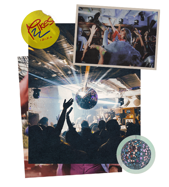
Mojito Mint – Yes indeed, it’s the same minty green as the balls in our Bathtub Club, but there’s actually a second source of inspo behind this shade that you may not recognise at first sight. It’s taken from the very distinct patterned shirt that Freddie Mercury wore to his legendary 41st birthday party at Pikes back in 1987 – the one and only shirt we’ve recently acquired at auction and added to our collection of Pikes memorabilia.
Once Ian had finally settled on our six major colours, the creative process flowed like daiquiris on a hot summer’s day by our pool. Design enthusiasts may note that we’ve now implemented the same custom font from the Pikes Magazine as our headline font across the entire site – good spotting! This builds further on the creative that was originally developed for us by UK agency Big Active, adding a sense of cohesion to all of our reading materials, whether online or in print.
Additionally, we’ve adopted the same analog-esque quality to the photography across all of our platforms, in keeping with our print materials like The Pikes Cocktail Book and Pikes Magazine, in an effort to bring that hazy-lazy ambience of a day at Pikes into your homes (or more likely, your phones), wherever you may be in the world.
Linking the bricks-and-mortar days of Tony Pike with the Ibiza Rocks House takeover era and all those wild, wacky and wonderful moments in between without losing the essence of Pikes itself is hugely important to us. Our marketing team and graphic designers do all their hard graft behind the scenes, so while their photos may not pop up in our Instagram feed like our bar staff, restaurant team, DJs and the beloved faces of Pikes from years gone by, their work is like the glue that keeps our brand together. So, on this auspicious day, as we unveil their latest magic to the world, we’d like to give them all a standing ovation. Bravo, team Pikes!